Interview with Kim Wittfeld (uglyful): "T-Shirts are media"
Kim Wittfeld, 25, a student of media design in Cologne, creates t-shirts for his label uglyful, “existing since October ‘09 and not needing a description” (presentation on the homepage). Besides his own designs, it also features creations made by friends who use the infrastructure of uglyful. A couple of days ago, he contacted me via email asking me whether I would like to write about his label and the t-shirts. As I am always interesting in exchanging with creative people, I proposed an interview with Kim about his t-shirts, his work and his inspirations. I hope it can inspire you and help you on your way.

Uglyful is an interesting name… What does it mean?
With my label, I wanted to express something being ugly and beautiful at the same time. An ambivalence making a brand strong, because it does not only have positive sides, but also fallible and imperfect sides. The name “uglyful” represents all this: Everyone knows the word “ugly”, but you do not think of “beautiful” on first sight, that is the trick. Furthermore, it looks very beautiful from a typographic point of view. The up and down movements of the font are very interesting.
How did you arrive at designing t-shirts?
I always liked cool, interesting shirts. There are still not enough good ones. Then, when I injured my knee during volleyball, I ended up having a lot of time and approached the thing on my own. The most important aspect is that you do not have any money as a student. How can I produce t-shirts without spending anything? I started experimenting: Stencils and spray cans look superb, but the problem is that the paint washes off. Then, I considered flexo and flock. This has great opportunities, the quality is superb, and you can produce in low volumes. On the long run, I want to work more with silk-screen printing, even if this means having a minimum volume of 50 pieces and the required capital. As soon as I have this, I want to invest constantly in order to create new possibilities: testing which motives work in order to optimise it for silk-screen printing.

Of course, every method has its pros and cons. In flexo printing, you can combine each shirt in individual colors. With some shirts, that leads to more than 1,000 combinations, comprising various materials and textiles. This is obviously not possible in silk-screen printing, having the shirts in stock. This is a fundamental decision: Where do you want to go as a designer? Do you want to provide designs or let the customer combine them individually and let him live out his creativity?
How did you work on your motives?
I created the designs with Illustrator. Seeing a motive on the computer and later on the shirt is something completely different. You have to gradually develop a feeling for the medium t-shirt. T-shirts are media, you cannot compare that to paper or the internet. Every medium has its own needs.
What impresses me is that your motives draw from a variety of sources. You pick artistic styles or well-known motives up and change them. What inspires you, how do you find new ideas?


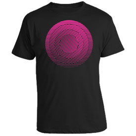
I often think purely visual and minimalistic, always with a basic though. “Fuck you now” is an example, a purely typographic motive. I see that as a kind of buddhistic tolerance, “do whatever you want”. I had the idea of using moving and winding ribbons, creating the words. Or “Geometrix”, a motive with twisted circles, reminds me of OpArt, a art form of the 60s. I am a fan of reduced motives and wanted to use circles. The design was the result of experimenting.

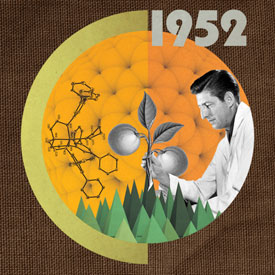
Creativity is often a coincidence, and I rely a lot on my versatility. I studied biology and am still very interested in natural sciences. I like retro styles, but not like orange, brown or a volkswagen bus, but more like the retro feeling of the 60s and 70s, everything being possible, firmly believing in progress. This is also part of “1952”. This is a feeling I sometimes have, which I try to express. Researching images was very important to create a collage with images of this time. I try to pick up timeless things, not short-lived trends.
What should young designers do? Which advice would you give them?
I am still standing on the beginning. I would advice finding your own style, doing a lot of experiments. And think about what you are good at, for example stitching or illustrating. If you excel in something like that, you should use it. From a technical viewpoint, this is simple. Everybody knows Spreadshirt, and there are copy shops in each city. But it is a lot of work to create a production chain. You have to ask yourself: What is my mission, what can I do, what am I willing to do? This is my advice, and be careful with large investments, because the market is small.
What does fashion, or shirts in particular, mean to you?
Fashion and shirts are means to show your inner being and your attitudes to the world.
License: The images are copyrighted by uglyful (thank you that I may use them, Kim!), the text is CC BY SA licensed as usual.